
The Psychology Behind Fonts & Colors in Branding
Have you ever looked at a brand and instantly thought, “that feels trustworthy” or “that feels fun?” There is a good chance the fonts and colors played a major role in that first impression.
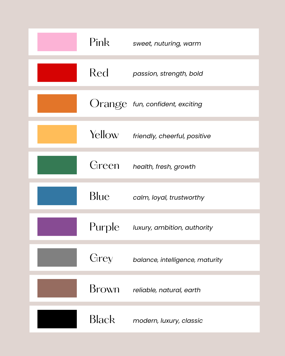
Branding is about so much more than choosing pretty colors or trendy fonts. Every design choice communicates something to your audience before they ever read a word about your business. Colors naturally create emotion and connection. Blue often feels calm and trustworthy, green feels fresh and healthy, yellow feels cheerful, and black tends to feel modern and elevated.
Summer branding especially tends to lean into brighter, warmer tones because people naturally associate those colors with energy, travel, sunshine, and positivity. Even small seasonal changes in your marketing can make your brand feel more engaging and current.
Fonts matter just as much. Serif fonts often feel timeless and professional, while sans serif fonts feel clean and modern. Script fonts can create a softer, more feminine, and personal feel when used intentionally. The key is making sure your branding actually reflects your business's personality and the audience you want to attract.
One of the biggest mistakes businesses make is choosing branding based solely on personal preference rather than strategy. Your branding should tell your story, communicate your values, and create a feeling people remember.
At Express Strategic Services, we specialize in creating intentional brands that help businesses clearly communicate their message, personality, and overall feel. From fonts and colors to logos and visual direction, every detail matters when building a brand people connect with.